Recently, I had a scientist in my classroom. What’s so special about that, you might ask? The fact is, the majority of our clients in my applications classes are serving in roles with both public and private businesses which promote sales, as well as government entities. People are looking for ways to communicate, to manage data such as sales and inventory and cost, and to analyze data to aid in better decision making. Some people are looking for skills to help them design ads and newsletters and websites, and the tools they learn are used in increasing sales and traffic to a business.
Government employees are looking for ways to track spending, or income. They might also be tracking how much medicine is prescribed by particular doctors and the usage of gas in a fleet of vehicles, just to name a few. But the common thread here is that all of these tasks can be accomplished with Microsoft technology taught in classes at LRS Education Services. Even the scientist who wants to form a hypothesis based on the data collected and analyzed. Instead of dollars and cents, a scientist might be analyzing blood alcohol levels or levels of specific chemicals in water over time. Microsoft’s Power BI is now the tool that users have to supply visualizations to all forms of data, regardless of the type of profession for which a person is employed.
First of all, Microsoft has once again scored in the department of giving us a user-friendly interface in Power BI to show our work. Instead of trying to determine what data we need to click and drag on an Excel spreadsheet to create a chart, they have now provided us with task panes and buckets where we can simply drag and drop our desired fields.
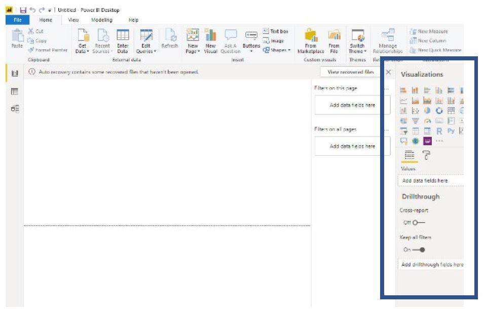 The visualizations task pane has every type of chart imaginable, as well as dual axis chart for comparing data. So, first you pick your chart, then you decide what data you want to display. And then there’s the filter pane, like a pivot table, only better! Because after all, when we analyze data, we don’t need every single piece of data; we might only want to evaluate the amount of sales from fourth quarter, for the last five years. Or a scientist might evaluate the blood alcohol levels of DUI offenders over the last five years. Then we can all start making decisions. Are sales, or the DUIs, trending up or down? What are the variables that might be affecting the data?
I learned a valuable lesson at about age 25 when I was writing a dissertation, no excuse me, a marketing plan for my company. At about 75 pages, I knew I had included every detail for the entire SWOT Analysis—all typed double spaced and even with a pretty cardstock cover. One look from the Senior VP of Marketing, and I learned something I will never forget. She said, “Bill and Abe don’t want to see all that typed documentation. They don’t have time to read it. Give them some charts and graphs, some bullet points, and add some text boxes.” At that moment, I learned that the higher up you go on the corporate ladder, the less time you have to read everything put in front of you. One chart in the middle of my text told them everything they needed to know about a topic, in most cases. And that was a very long time ago. Today, we are on information overload. Forbes magazine contributor, Bernard Marr, stated in 2018 that “there are 2.5 quintillion bytes of data created each day at our current pace.” Quintillion bytes? The average American worker is just learning about a terabyte.
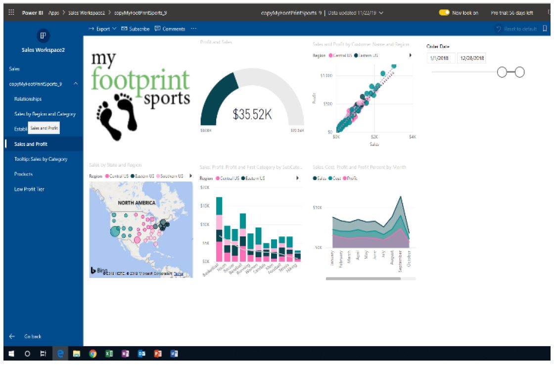 Secondly, Power BI creates instant dashboards. Dashboards that we used to have to configure into Microsoft Excel, making sure that all the data is aligned together and not overlapping with any other data. In Power BI, we just click on our canvas and click the chart we want, and Power BI puts it all in place. In the example, we can see charts for Sales by Region and State, Profit and Sales, Profit and Sales by Category and Sub Category, or by Customer Name and Region. And if you’re familiar with pivot tables in the 2016 version, you also can appreciate the slider in the top right of the screenshot. Just change the dates in the text boxes, and watch the results on every chart change. Instant answers in a society where we are currently ordering from Google more than 40,000 searches every SECOND!
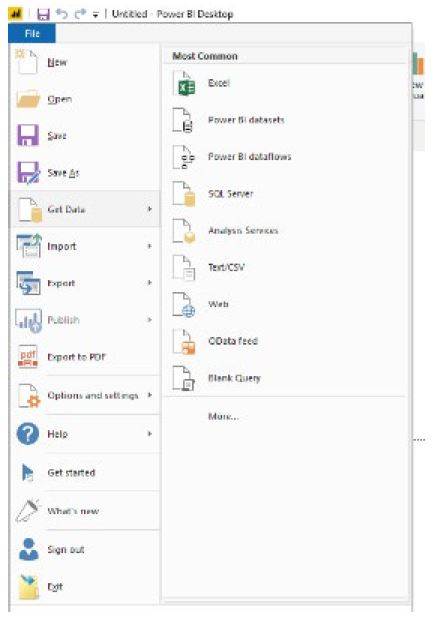 And where does this data come from? It comes from everywhere, but the most common places include Excel files, SQL servers, and other databases. There are also services that provide data lists. Getting the data doesn’t seem to be a problem for most people; the problem lies within the reality that we have all this data; now what do we do with it? In fact, people have data and don’t even realize they have data, and in Power BI, you never have to use just one dataset. Power BI allows combining data together, as well as creating new calculations from within existing data.
Last of all, the beauty of Power BI lies in the publishing potential with availability from desktops to mobile phones. Share a report or an entire dashboard, and view them all no matter where you are. Install the mobile app to interact with Power BI, and even share reports and dashboards via text or email. Power BI is built for anyone with data that needs to be analyzed, and there just isn’t anything better in the realm of technology today. Give it a try, and start by visiting LRS Education Services-PowerBI for information on prerequisites and the syllabus. For further questions, call us at 877-832-0688, ext. 1493 or email at getsmart@lrs.com.
Kelly A. Cummings
Applications Instructor
LRS Education Services
217.793.3800
kelly.cummings@lrs.com